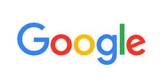
Google's new logo actually has a functional purpose


Change is hard and Google, which has used the same recognizable four-color wordmark since 1999, is shaking things up with the introduction of a spiffy new sans-serif logo. Comfort yourself with this, at least: The new logo isn't here just to shake things up — it's actually got a real, functional purpose.
Losing the little "tails," or serifs, on the letters makes the font more legible when it's written in tiny sizes. Fast Company points out that if you're reading off of a 2.5-inch Android Wear watch, or a cell phone, the new font will now be just as readable as if it were projected on a 50-inch TV. The new logo is also animated, morphing into small dots that playfully circle each other on screen — which matches the playful look of the new wordmark, too.
And of course there's the fact that it's consistent. Now that Google belongs to the parent company Alphabet, which itself uses a sleek, modern, sans-serif look, the new logo keeps it all in the same (font) family.
Subscribe to The Week
Escape your echo chamber. Get the facts behind the news, plus analysis from multiple perspectives.

Sign up for The Week's Free Newsletters
From our morning news briefing to a weekly Good News Newsletter, get the best of The Week delivered directly to your inbox.
From our morning news briefing to a weekly Good News Newsletter, get the best of The Week delivered directly to your inbox.
Create an account with the same email registered to your subscription to unlock access.
Sign up for Today's Best Articles in your inbox
A free daily email with the biggest news stories of the day – and the best features from TheWeek.com
Jeva Lange was the executive editor at TheWeek.com. She formerly served as The Week's deputy editor and culture critic. She is also a contributor to Screen Slate, and her writing has appeared in The New York Daily News, The Awl, Vice, and Gothamist, among other publications. Jeva lives in New York City. Follow her on Twitter.
-
 5 carefully selected cartoons about the Trump-Daniels jury selection process
Cartoons Artists take on a stress-free life, rare peers, and more
By The Week US Published
-
 Loire Valley Lodges review: sleep, feast and revive in treetop luxury
The Week Recommends Forest hideaway offers chance to relax and reset in Michelin key-winning comfort
By Julia O'Driscoll, The Week UK Published
-
 Myanmar: the Spring Revolution and the downfall of the generals
Talking Point An armed protest movement has swept across the country since the elected government of Aung San Suu Kyi was overthrown in 2021
By The Week Staff Published
-
 Empty-nest boomers aren't selling their big homes
Speed Read Most Americans 60 and older do not intend to move, according to a recent survey
By Peter Weber, The Week US Published
-
 Brazil accuses Musk of 'disinformation campaign'
Speed Read A Brazilian Supreme Court judge has opened an inquiry into Elon Musk and X
By Rafi Schwartz, The Week US Published
-
 Disney board fends off Peltz infiltration bid
Speed Read Disney CEO Bob Iger has defeated activist investor Nelson Peltz in a contentious proxy battle
By Rafi Schwartz, The Week US Published
-
 Disney and DeSantis reach detente
Speed Read The Florida governor and Disney settle a yearslong litigation over control of the tourism district
By Peter Weber, The Week US Published
-
 Visa and Mastercard agree to lower swipe fees
Speed Read The companies will cap the fees they charge businesses when customers use their credit cards
By Peter Weber, The Week US Published
-
 Reddit IPO values social media site at $6.4 billion
Speed Read The company makes its public debut on the New York Stock Exchange
By Peter Weber, The Week US Published
-
 Housing costs: the root of US economic malaise?
speed read Many voters are troubled by the housing affordability crisis
By Peter Weber, The Week US Published
-
 Feds cap credit card late fees at $8
speed read The Consumer Financial Protection Bureau finalized a rule to save households an estimated $10 billion a year
By Peter Weber, The Week US Published